User-Friendly Link in Bio Design: Make Your Page Easy to Use
Visitors arrive on a phone with one thing in mind. Put it first, offer fewer and clearer choices, keep text readable and make every button easy to tap.
On this page
User-friendly link in bio design means a visitor finds what they came for in one glance and one tap. Most people arrive from a bio or a story on a phone, often inside an app’s built-in browser, with a specific thing in mind. A good page puts that thing first, offers fewer and clearer choices, stays readable at small sizes and works for people who use larger text or assistive technology. This guide walks through each decision with a checklist you can apply in an afternoon.
Start with what visitors came for
Rank links by intent
Before touching colors or fonts, list every link on the page and ask what share of visitors want each one. A restaurant’s visitors mostly want the menu and reservations. A creator’s visitors usually want the latest video or the product just mentioned in a post. A venue’s visitors want this weekend’s event and directions.
Put the top one or two at the top of the page, above anything decorative. If the answer changes week to week, move the priority link when the campaign changes, rather than adding a new link at the bottom.
Write labels people recognize
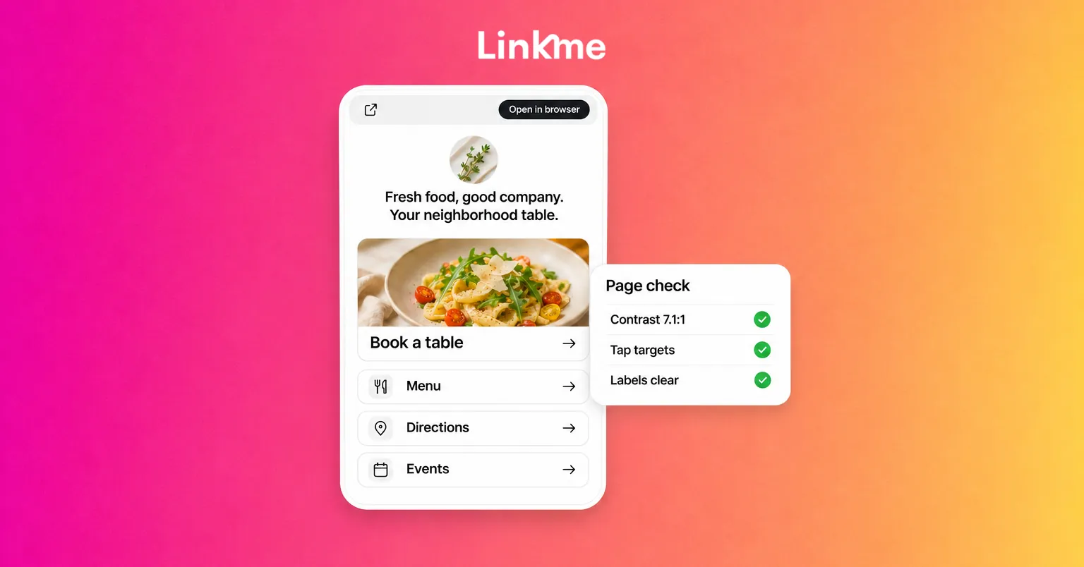
A label should say what happens when someone taps. “Book a table” beats “Reservations portal”. “Spring menu (PDF)” tells people they are about to open a file. Avoid clever labels that hide the destination, and avoid repeating your brand name on every button.
Offer fewer, clearer choices
Every extra link competes with the one you most want tapped. Some practical rules:
- Merge near-duplicates. Three links to three shop collections can often become one link to the shop.
- Remove what is out of date. Last month’s event, an expired code or a finished giveaway makes the whole page look neglected.
- Group the rest. Use headers to create short sections such as “Visit”, “Watch” and “Shop”, so people can skip what does not apply to them.
- Compress long lists. A horizontal carousel holds related items without making the page scroll forever.
On Linkme you can add unlimited links, which makes editing discipline more important, not less. The links and websites guide shows how to reorder links by dragging and display them as a horizontal carousel, and headers let you split the page into sections.
Make it readable
Pick one readable font
Choose a font that is easy to read at small sizes for body text and labels. Decorative fonts work for a name or a header, not for a list of ten buttons. Keep to one or two fonts across the page.
Check contrast
Low contrast is the most common reason a page looks stylish on a large monitor and unreadable on a phone in sunlight. The Web Content Accessibility Guidelines set a minimum contrast ratio of 4.5:1 for normal text and 3:1 for large text. Use any free contrast checker to compare your text color with your background.
Be careful with photos and video behind text. A video profile or busy background image changes brightness from frame to frame, so text that reads well at one moment can disappear the next. Give text a solid button or a darker overlay behind it.
Keep the bio short
Two lines that say who you are and what to do next do more than a paragraph. Put hours, locations or a release date in the bio only if visitors need them before they tap anything.
Size buttons for thumbs
People tap with a thumb, often while walking. Small targets placed close together lead to mis-taps and frustrated visitors.
- Make the main link the largest. Linkme featured links come in Big, Medium, Small and Button sizes. Use Big for the one link that matters most this week, and smaller sizes for supporting links.
- Do not make everything big. If every link is the largest size, none of them stands out.
- Leave space between targets. WCAG 2.2 sets a minimum target size of 24 by 24 CSS pixels, or enough spacing around smaller targets. On a phone, larger is better.
- Use thumbnails to help, not to decorate. A recognizable product photo or event image helps people find the right link faster. Ten unrelated stock images do not.
Fix the in-app browser problem
Many link in bio visits open inside the Instagram or Threads browser, where people are signed out of their usual accounts. That can turn a quick checkout or ticket purchase into a login screen.
On Linkme, the Deeplink Banner adds one button to your page that opens it in Safari on iPhone or Chrome on Android, where links work the way people expect. It is a single switch in Quick Settings, available on every Business seat and on Pro. Turn it on if your page sends people to stores, ticketing or anything that needs a signed-in session. See Pages and QR for how the banner and the rest of the page builder fit together.
Accessibility checklist for a link in bio page
An accessible link in bio is easier for everyone to use, not only for people with disabilities.
| Check | What good looks like |
|---|---|
| Contrast | Text meets 4.5:1 against its background, including over images |
| Labels | Each link says where it goes, without relying on an icon alone |
| Emoji | Used as an accent, not in place of words; screen readers read each one aloud |
| Text in images | Key details such as dates and prices also appear as text |
| Motion | Animation is used on one link at most, and nothing flashes |
| Video | Autoplaying video has captions if it carries information |
| Target size | Buttons are easy to tap and not crowded together |
| Language | Short, plain sentences; abbreviations spelled out once |
Test it like a visitor
Design decisions only prove themselves on a real phone.
- Open the page from your own bio inside Instagram and TikTok, not from a desktop browser.
- Time a task. Ask a friend to find the menu, the next show or the newest video. If it takes more than a few seconds, move that link up or relabel it.
- Increase your phone’s text size and check that nothing overlaps or gets cut off.
- Check in bright light and in dark mode, if your visitors use it.
- Tap every link and confirm each destination loads and is current.
- Read the numbers. Every link shows its own click count in your Linkme analytics. Links that get almost no clicks for a month are candidates to remove or merge.
Repeat the check whenever you change a campaign. A page drifts out of shape one added link at a time.
Frequently asked questions
How many links should a link in bio page have?
As many as visitors actually use, and usually fewer than you think. Lead with one to three priority links, group the rest under headers or in a carousel, and remove anything that has not been tapped in weeks.
What makes a link in bio page mobile-friendly?
A short bio, the most important link first and largest, readable text with good contrast, buttons that are easy to tap, and a way out of the in-app browser when visitors need to sign in or pay.
How do I make my link in bio page accessible?
Use clear text labels, meet contrast guidelines, avoid putting key details only in images, keep animation to a minimum and caption video that carries information. Test with your phone’s larger text setting turned on.
Should I use animated links?
Sparingly. An animation on the one link you most want tapped can draw attention. On several links at once it becomes noise and can distract people who are sensitive to motion. On Linkme, animated links are a Pro feature.
A user-friendly page is mostly the result of editing: the right link first, fewer choices and nothing that makes visitors squint or hunt.